Peptide Landing Page Anatomy for Qualified Business Leads
Written by Peptide Growth Agency · Editorial standards
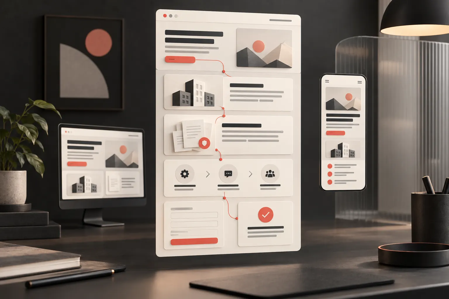
TL;DR
Build a peptide landing page around audience fit, clear scope, verifiable evidence and a useful inquiry path, not unsupported product claims.
A peptide landing page should help the right business visitor understand the offer and take an appropriate next step. Its job is not to persuade everyone. Clear audience fit, accurate scope, accessible evidence and a reliable inquiry path give the team a better basis for responding than a page built around vague promises.
This guide describes a suggested B2B page structure for peptide and longevity brand websites. It is not a product purchasing guide or a measured client case study. Peptide Growth Agency does not sell peptides, recommend suppliers or provide medical advice.
Start the peptide landing page with audience and task
Choose one audience and one main task before designing the page. A business partner requesting information is doing a different job from a visitor seeking customer support or a personal health answer.
Write a short page brief naming the intended visitor, the question they arrive with and the action your team can responsibly support. If the brief includes several unrelated audiences, separate the journeys rather than squeezing every offer onto one screen.
This is also the place to state business limits. An agency page can describe a website project. A brand page needs to describe its actual role and offer accurately. Neither should imply services, product access or outcomes beyond its scope.
Use that brief to review every section. If a module does not help the chosen visitor evaluate the offer or complete the task, it may belong on another page.
Module one: a clear opening and a specific next step
The opening needs a descriptive heading, a short explanation and a primary action. A reader should not need a pitch deck to understand what the page concerns.
Name the offer in plain words. Explain whom it is intended for and what the first step involves. Avoid a broad promise such as "transform your results" when the business can describe a concrete service or process instead.
Keep the button label aligned with the action. If clicking opens an inquiry form, call it an inquiry. If it downloads a guide, say that. Do not label a sales conversation as an approval, assessment or clinical consultation unless that accurately describes the service.
A useful opening can be brief. It does not need to contain every detail, but it should not create an impression that the rest of the page has to correct.
Module two: business scope and practical fit
After the opening, explain the circumstances in which the offer is relevant. List the tasks the business handles, the information it needs and any important limits.
For an illustrative agency page, this might mean the website platform, target market, project stage and type of help requested. These are planning examples, not proof of a particular client's results.
Avoid invented qualifications such as unsupported certifications or implied regulator endorsement. Use company details and experience only when they can be verified. A premium design does not replace accountable business information.
The buyer expectations guide covers identity, documentation, policies and contact paths in more detail. The landing page should make those routes available without forcing visitors to search the whole site.
Module three: evidence beside the statement it supports
Place relevant evidence near the question it answers. A claim about a process should link to that process. A case study should identify the reporting period and measurement basis. A document should be clearly connected to the subject it concerns.
Do not add a row of badges merely to fill space. Explain what each reference means and where readers can check it. If the evidence is limited, preserve the limit rather than making the wording more persuasive.
For product-adjacent documentation, avoid treating a certificate as proof of every statement on the page or as proof of authorization. Keep unresolved legal and regulatory questions for qualified review.
Conceptual images can help explain the page structure, but should not impersonate an actual client interface, facility or result. Separate illustration from evidence in captions and surrounding copy.
Module four: the process after the inquiry
Tell visitors what happens after they take the primary action. Will the team review context, send information or invite a business conversation? Explain the sequence in ordinary language.
A suggested process section might contain:
- Share the information needed for the stated task.
- The responsible team reviews whether the request fits its scope.
- The team responds with the appropriate next step.
Only publish response times the business can support. Do not promise an instant review when the process is manual or a guaranteed outcome when the team is evaluating options.
This section also helps the receiving team. A clear expectation reduces the chance that the visitor believes they have placed an order, secured approval or booked a service when they have only submitted a request.
Module five: a short form with useful context
Choose form fields from the task, not from the form builder's menu. Collect enough information for a useful response without asking for unnecessary sensitive details.
For a website-project inquiry, relevant fields might include a business website, market, project need and timeline. Explain why any less obvious question is needed. Give visitors a way to describe a situation that does not fit preset options.
Use visible labels, clear error messages and an understandable submission state. Do not hide essential instructions in placeholder text that disappears as the visitor types.
Then test the complete handoff. A success message is not proof that the inquiry reached the team. Submit a clearly labelled test, check the destination and confirm that the record contains the expected fields. Fix delivery problems before spending more effort on traffic.
Module six: supporting links without competing offers
Keep one primary action consistent through the page. Supporting links should help visitors evaluate evidence, understand policies or find the right contact route.
Avoid introducing unrelated offers near the final form. A second route can be useful when it serves a different genuine task, but it should not make the main path ambiguous.
Link descriptions should accurately match their destinations. Our peptide website design service explains the agency's implementation role. The landing-page mistakes guide complements this structure with common review problems.
Test each destination after publication, including mobile menus and documents. A link that loads a page but answers the wrong question still creates work for the visitor.
Make mobile review part of the structure
Inspect the actual page on a phone-sized screen, not only a resized design mockup. Check that headings, evidence, qualifications and form labels remain readable and appear in a sensible order.
Google's page-experience guidance encourages publishers to consider mobile display, security, intrusive interstitials and the overall experience. It also states that good Core Web Vitals results do not guarantee top rankings.
Use performance checks to find practical problems, not to promise an SEO outcome. Optimize images and scripts, keep the layout stable and avoid overlays that interfere with important content or the form.
The page should work when a visitor arrives directly from search. Do not depend on an earlier homepage visit to explain the business or the purpose of the inquiry.
Measure fit, not only form volume
Define a useful inquiry with the team that receives it. The definition should reflect the actual audience and service scope, not an arbitrary target number.
Review the questions visitors still ask, the context missing from submissions and whether the team can respond efficiently. Compare changes carefully and record other factors before attributing an improvement to the page.
More visits or submissions can include more irrelevant requests. Treat those counts as signals to investigate, not proof of trust or revenue gains.
Our editorial policy explains the site's source standards. For a practical review of your own structure, get a strategy audit. The audit is marketing guidance, not a guarantee of rankings, conversions or regulatory outcomes.
Frequently asked questions
What should a peptide landing page explain first?
Explain who the page is for, what the business offers, the limits of that offer and the next appropriate step. Keep the opening specific and accurate.
How many calls to action should a landing page have?
Use one consistent primary action for the page's main task, with supporting links for evidence, policies or contact needs. Avoid unrelated competing offers.
What makes an inquiry qualified?
A qualified inquiry fits the business's actual audience and scope and contains enough context for a useful response. More form submissions alone do not prove better lead quality.
Does a faster landing page guarantee rankings or conversions?
No. Usability and performance support a better experience, but rankings, inquiries and revenue are not guaranteed. Evaluate them alongside content relevance and business fit.