Peptide Branding: A Design System for Clarity and Credibility
Written by Peptide Growth Agency · Editorial standards
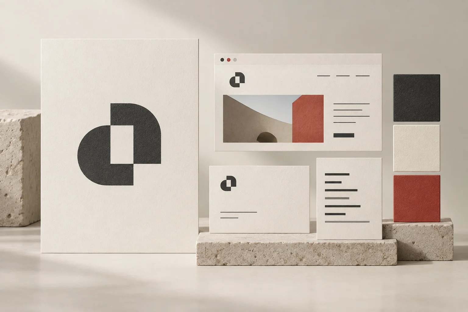
TL;DR
Plan peptide branding with a consistent identity, readable hierarchy and accurate visual impressions across your website, email and business materials.
Peptide branding should make a business recognizable and its information easier to understand. A polished identity can support that work, but it cannot prove product quality, regulatory status or a promised outcome. Build the visual system around accurate identity and readable communication before choosing decorative effects.
This guide is for peptide and longevity business owners planning a brand system, with Canada-first marketing context. It is not legal advice or approval for a product, label or offer. Peptide Growth Agency does not sell peptides or provide medical advice. The examples describe proposed design practices, not results from a named client.
Start peptide branding with the real business
Write a short identity brief before reviewing logos. Name the business model, intended audience, markets, communication tasks and limits on what the brand should imply.
A wholesale service, an information publisher and a clinic are different businesses. A shared interest in the category does not make the same symbols, wording or contact paths appropriate for all of them.
Define what visitors need to recognize: the company name, what it does, where to find supporting information and how to contact the correct team. Separate those facts from aspirational words such as premium or innovative.
The buyer-expectations guide explains the questions a website should answer. Use those questions as design requirements rather than relying on a mood board alone.
Define premium as a set of usable choices
Premium is not a fixed palette or an instruction to make everything dark. Translate the desired feel into decisions the team can apply consistently.
For example, a restrained system might use a limited colour palette, generous spacing, clear type sizes and one recognizable image approach. A warmer system might use softer surfaces and more conversational layouts. Neither direction excuses hard-to-read text or unclear business scope.
Judge each direction through an actual task. Can a visitor find documentation? Can an inquiry contact identify the service offered? Can a team member create another page without inventing a new layout?
Keep the first design review small. Compare a homepage opening, a document-summary card and an email header using the same direction. Beautiful isolated artwork is not yet a working brand system.
Give typography and colour clear jobs
Specify the type roles needed for headings, body copy, captions, navigation and important actions. Record sizes, line spacing and permitted combinations rather than handing over only font names.
Test long titles, ordinary paragraphs and source notes at the intended viewing size. If a design works only with short placeholder copy, it has not solved the real content problem.
Assign colours by role: primary text, secondary text, background, links, actions and notices. Check whether links remain identifiable and whether a muted caption is readable beside the paragraph it qualifies.
Do not use a pale colour to make a material limitation visually disappear. A qualification belongs where the reader can connect it to the statement. Consistent hierarchy should help understanding, not hide inconvenient information.
Review the impression created by images
Brand visuals communicate alongside the words. Read the page as a whole before deciding that technically accurate copy is enough.
The Competition Bureau's general impression guidance explains that courts consider the overall impression as well as literal meaning. It includes examples where an accompanying illustration creates a misleading impression despite accurate text.
For a brand review, ask what a visitor might infer from uniforms, laboratory scenes, seals, charts and product imagery. Do not imply a facility, professional endorsement or authorization that has not been verified.
The Bureau's false or misleading representations guidance also discusses inaccurate illustrations and untrue claims of association with third parties. A badge or borrowed logo is not harmless decoration when it suggests a relationship.
Use clearly conceptual illustration for abstract topics. Use verified actual imagery when depicting a real product, place or business asset. Keep the distinction visible in captions and review notes where it affects interpretation.
Build a small family of reusable layouts
Create templates for recurring communication tasks, not every imaginable asset. A useful first set could cover a website opening, an information card, an article header, an email message and a business presentation page.
Give each template a stable order: identity, main point, supporting context and next step. Allow enough flexibility for different content lengths without changing the system's basic logic.
Define where evidence, source dates and limitations sit. The claims-review checklist can support the editorial review, while the design system controls whether that context stays readable after layout changes.
Keep icons understandable without making them do the work of a sentence. A check mark should not turn an unreviewed statement into apparent approval. If a status matters, write what has actually been checked and who owns it.
Keep identity consistent across channels
Compare the company name, logo variants, contact details and service descriptions across the website, email and business materials. Resolve conflicting details before adding more assets.
Record which logo variant belongs on light and dark backgrounds, the minimum practical display size and the spacing around it. Test the small version in navigation and an email header, where a complex mark may become unreadable.
Use the same factual scope across channels. A careful website description should not become a stronger claim in a social card or sales document because space is limited.
Consistency does not mean identical layouts everywhere. A phone screen needs different spacing from a presentation. Preserve the identity and information order while adapting the composition to the medium.
Test the system with real content on mobile
Inspect actual rendered screens instead of approving only design-file thumbnails. Use representative long headings, navigation labels, paragraphs and source links.
At phone width, check whether the first screen explains the business without requiring horizontal scrolling. Read a longer page, follow an internal link and inspect the next-step button. Make sure essential information survives stacking and image cropping.
Then compare the desktop view. Extra space should improve the layout, not separate a qualification so far from its statement that the connection disappears.
Use a short issue record: what failed, which layout is affected, who will fix it and what the acceptance check is. Retest the changed screen rather than assuming a shared component fixed every placement.
Deliver rules the team can maintain
A brand handoff should include approved source files, exported variants, type and colour roles, image guidance, sample layouts and practical usage notes. Confirm the rights and licences needed for fonts, imagery and other assets.
Name an owner for changes. Keep a dated version record so the website team and email team are not using different approvals. Separate retired assets from current files rather than leaving both in one undifferentiated folder.
Measure the system through useful observations: recurring layout mistakes, unclear navigation, inconsistent identity details and questions visitors still ask. Do not claim a revenue improvement merely because the new artwork looks better.
Our peptide branding and packaging work connects identity rules with practical production needs. For a review of your current touchpoints and the next scope to fix, request a strategy audit.
Frequently asked questions
What should peptide branding include beyond a logo?
Include typography, colour roles, image rules, information hierarchy, reusable layouts and approved identity details. Test the system across actual website, email and business-material tasks.
Does premium design prove product quality or regulatory approval?
No. Visual polish is not evidence of quality, safety, authorization or business relationships. Keep factual statements tied to appropriate evidence and review the impression made by imagery.
Should a peptide brand copy a clinical visual style?
Choose a style that fits the real business and audience without implying medical authority or a service the business does not provide. Readability and accurate identity matter more than borrowed clinical cues.
How can a team check brand consistency before launch?
Use a small set of real layouts on desktop and mobile, compare identity details and hierarchy, and inspect links and supporting facts. Record approved files, rules, owners and unresolved issues in the handoff.